Finals made in photoshop an exam day.

April 14, 2011

this is a collection of images that i created using photoshop, during the exam hours of my graphics exam. all together these many peices make my entire album. the final peice is all presented in an actual case.  the first image is the actual front and back of the album booklet itself. the first problem that i encountered was gettig photoshop to actually get the covers to scale so that when i printed them they would fit. the image is a picture of the devil as a goat, inside of an inverted pentogram. with a smily face stuck on top to create an ironic message. i feel that black and white where the best choices  because they contrast the most to reflect funhell.

the second image is the interior image of the album artwork. it is rather basic sticking to the simple idea of simplicty makes things look good.  the picture of thom yorke i felt was nessasserry to allow the buyers see what the auther of the album looks like. this also came in use becasue when the cd cover goes on top it looks like a giant head ontop of someones shoulders.

the cd cover is a large version of the smily face ontop of the album cover. its purpose was to create a new kind of cd that is quite quirky and fun to look at.

the back of the album cover is designed to list all of the album song names in a simple way and to look attactive.

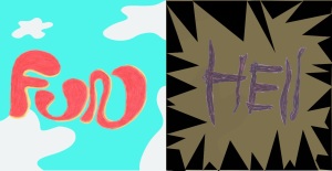
the first peice of artwork with fun-hell written on them are the basic form of art designed to reflect fun and hell in such a certain way. the writing of fun and hell i drew myself  and scanned in myself to make them exactly how i wanted them to be.

the artwork opposite is a drawring that i did entirly myself to depict the main message of fun hell showing that thom yorke walks over everything an sugar coats things, making light of a dark situation. and the blue and red backgrounds i used the magic wand tool to create a child like drawn effect to it. to make it look like worn paper.

the final peice is the thank you’s and information bit to the album. it is designed to simply make something to read in the album.

overall these peices took me a long time to make.

descision towards final

April 14, 2011

i have decided that my final will be an entire album called Funhell by Thom yorke. i have concidered many possible options that are all designed to represent funhell as an ironic statement about the world.

Artists, and movements

March 26, 2011

i have chosen to focus on movements such as, Surrealism, Expressionism, Pop Art, Van Gogh and Piet Mondrain. i chose surrealism and expressionism as it might be interesting to see what kind of desingns come out of it. and pop art is something that can easily be made into an album cover etc. i wanted to choose stuff however that will challenge me. so peit mondrain and van gogh should be quite hard to replicate.

here are some examples of their work.

surrealsim

Epressionism

pop art

peit mondrain

Research

March 26, 2011

Tto gain extra knowledge as to what kind of inspiration i can gather of the internet, i will be researching 2 artists, and 3 art movements in great detail, and producing experiments in their styles, to see weather or not they fit my final goal.

My exam choice

February 14, 2011

for our final exam project this year we where given a choice of topics to do as our final. i chose Musicians. On the topic of musicians i have decided that i will make an entire cd case and cover for either a Radiohead best of style album, or a new Thom Yorke album. for this project i will research other examples of album covers, and certain artists and movements that would be interesting to make as an album cover.

My first game poster design idea.Photoshop.

January 13, 2011

this is my  picture of my game poster for   my game black out, please leave some comments that could be very helpful towards my project. thanks.

Examples of advertising. Resistance 3

December 31, 2010

  this advert also uses real people. It makes the game look like a movie, which is much like what games are. Movies you can play. It makes the game too look exiting with montage footage of guns and lights in the dark. Giving it a slightly scary edge to it.

Examples of video advertising.Black Ops.

December 31, 2010

   this advert uses people rather than animated people in the add. This i think along with the slogan “There is a soldier in all of us” really targets the general public, and makes us try to feel like we agree and try to encourage us to buy it. Also it is quite funny, which makes us think that the game will be fun, and exiting.

Eastern Art Influence

December 14, 2010

on his page there are some pieces of horror art, from  japan. These are two of my favourite pieces. The first image is very simple but that is why i like it. It is where the horror comes from. The hands coming over the shoulder are barely noticeable, but when you do notice them, they are quite scary to look at. It is mysterious and makes you think what is behind her. from this image i could get some inspiration, if i had my main character from black out, maybe see half of his face, with a hand on his shoulder.

the second image is a bit like whats going on? there is a woman with snakes coming out of her eyes and yet again this theme of the hands on the shoulder. This image is a bit demonic, which is why i like it, and why i put it on there.

Abstract Art

December 8, 2010

The first image uses he technique of meshing images and symbols together in random patterns. Taking what was an ordinary image  and moving it around to create new meaning. I for example i used this method in my game poster i could take a picture of my lead characters face and then move it around and putting text inside to symbolise humanity falling apart, or shattering which suits the theme of the storyline.

The second image is very interesting because at the moment it looks innocent but if i where to take this image and make the blue circles red or orange i would look more like guts and insides rather than this rather tranquil looking image with calm colours like blue. This technique is very useful, taking one image, changing the colour  to create a different mood. For example if black was my game background you think horror or darkness, if it was yellow it could imply humour or happiness.